Like most things, it's a gradient/continuum, and achieving true excellence is the result of iterating and testing until all decisions/selections are correct.
Well Heaviside was a bit of a kook, especially in his later years, and that claim seems entirely in character :) My contacts with Fraktur are intermittent and brief, so I don't really have an opinion; I mostly encounter it in an old German-English dictionary which I occasionally consult, where the German text is printed in Fraktur. I don't have too many problems reading it.
Of course, these wannabe guys use the proper fraktur. They usually use the wrong s and don't care about proper ligatures.
And many of them use Fraktur wrongly (in particular: wrong usage of long vs round s; not using compulsory ligatures).
not /s
Using wrong letters and ligatures (in Fraktur) has barely anything to do with grammar; this is rather orthography.
Also the modern far-right in Germany has an undercurrent of monarchists, we've just lost the political language to label them as such - much like how we unironically refer to conservatives as "centrists" because referring to anyone but a nazi as "right-wing" is often implied to have certain undertones, although the conservative party that helped pass the Enabling Act was literally called the Christian Center Party.
And although the Nazis weren't exactly ideologically coherent - fascists generally aren't - the driving ideology in the modern German far-right (including within the AfD) is actually völkisch nationalism which the Nazis were at least making heavy use of in their propaganda.
I'd even argue remnants of völkisch nationalism even made it into the German constitution: it uses the term Volk and Volkszugehöriger (in Art. 116 Abs. 1 GG) without defining either of them. The definition of Volk instead had to be provided by a constitutional court ruling - German citizens plus Volkszugehörige - and that second term is defined in a seperate law (§ 6 BVFG) which uses a very narrow and arbitrary definition that's clearly a condensed bureaucratic remnant of a much broader ideological pre-existing definition (arguably the consequence of having to deal with a similar problem as laws trying to combat racism that want to avoid validating "race science" by pinning down exact definitions for each relevant category)[0].
Also in German popular culture the colloquial definition of "Deutsch" seems to be very much colored by völkisch ideas: someone who is "ethnically distinct" (e.g. skin color, eye shape) is generally regarded as a "migrant"/"foreigner" even if they are German citizens, speak fluent German, are culturally German and have multiple generations of direct ancestors who lived in Germany.
[0] Source: Bundestag white paper "Zu den Begriffen „deutsches Volk“, „Deutsche“ und deutsche Volkszugehörigkeit“ im Grundgesetz":
https://www.bundestag.de/resource/blob/643190/7855da277bbd33...
References:
Art. 116 GG: https://www.gesetze-im-internet.de/gg/art_116.html
But that isn't quite what it says either. Pragmatic considerations may have given the decisive push, but it seems that Gothic script had always been in a precarious position on the faultline between the archaising and modernising instincts of Naziism. The specific tall story that was eventually presented about how it was Jewish was quite clearly a low-effort post-hoc justification, but it seems it was always quite easy to take an anti-Fraktur stance from a Nazi perspective: see A. Hiedler, op. cit. And even just going on the small extract provided from that Reichstag speech https://penelope.uchicago.edu/encyclopaedia_romana/luftwaffe... , it seems that Hitler's objections weren't just pragmatic: before he gives a practical reason to drop Fraktur, he attacks Gothic revivalism in general on aesthetic grounds, no small matter to the Nazis. My assumption is that his objection to Gothic revivalism was based partly on a general aesthetic instinct that too much revivalism is cosplay and naff; and partly on a disapproval of medieval Germany specifically as a model or claimed precursor for Nazi Germany, for various reasons. A possible third, type-specific, factor, mentioned in https://penelope.uchicago.edu/encyclopaedia_romana/luftwaffe... , is that compared to "Atiqua" "Fraktur" looks vaguely kinda more Hebrew-ish. That could plausibly have been the underlying sentiment behind the (apparently completely false and baseless https://worldcrunch.com/culture-society/nazi-typeface-fraktu... ) story spun about Jewish printers in Schwabach.
You cannot argue with stupids
I'm almost hundred percent sure I've seen Mein Kampf seen set in Schwabacher which was printed while Hitler was still alive, but I'm not sure on the exact year. I'm also certain I've seen Hanns Johst's plays posters set in (stylized) Fractur. I'm sure you can find the Nibelungen posters with the same kind of (stylized) font from that time.
So, at least in the way things are presented in Kapr's book, and I think it was understood that way even before him, Fractur has much to do with the development of printing, especially the part where individual letters were reused (early printing used to etch the entire page at once). Germans would have a reason to be sentimental about that font because, after all, they were the inventors of this kind of printing. I could see how this would be in line with nationalism.
Similar, for example, in Russia, the stylized variant of pre-Peter I (a.k.a. "early Cyrillic" or "church-Cyrillic") is still a popular choice for all sorts of nationalist propaganda posters, even though it was replaced in the late 16 hundreds.
Similar, in Ukraine, there are fonts that strongly associate with nationalism, eg. https://en.wikipedia.org/wiki/Ukrainian_skoropys and Georgij Narbut's font: https://luc.devroye.org/fonts-86142.html even though they are impractical and aren't used for everyday tasks.
In Hebrew, there's Hayim font, that strongly associates with the Zionism / Socialism movement of the pre-declaration of independence and soon after, but the font otherwise isn't very useful for modern everyday needs.
* * *
Bottom line: I don't think Nazis represent the whole spectrum of nationalism. On the other hand, nationalism will find and glorify original local developments, in typography just like in any other field.
My reading of Nazis is that nationalism wasn't their main goal. Their appeal was "law and order at any cost", "removing impediments to prosperity, whatever they may be" much more so than digging up historical relics confirming the eternal greatness of Aryan people. Textbook nationalists are rarely expansionists: they may be hostile to their neighbors having claims to some historically contested territory, but they don't normally launch conquest of far-away lands. The later seems to be more of a thing of people with more universal ideologues.
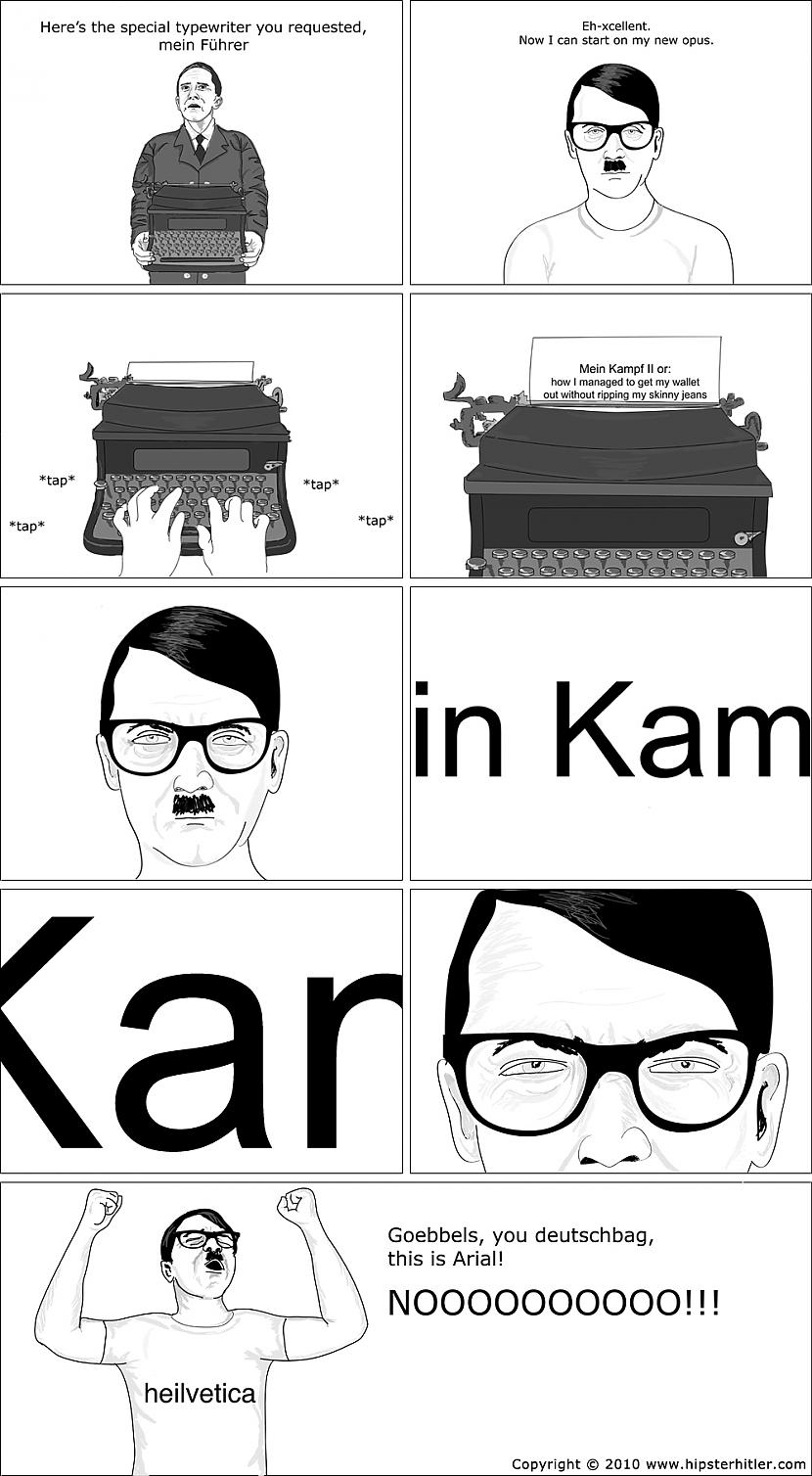
I didin't know that Hitler personnally disliked Fraktur, must have helped.
Fraktur needs some eye adaptation to read it fluently because we are not used to some ligatures anymore and the typographic conventions can be different in the late 18th / early 19th century (for instance the Grimm brothers advocated against the captitalization of German common names), but I find it quite legible.
It would probably be better if State Department would get their own typeface -- as opposed to picking one from MS Office defaults -- but even then, I'd argue for Antiqua style (serif). SCOTUS, for one, is using Century Schoolbook.
P.S. I don't care at all about Rubio, Dem-Rep divide, "diversity" vs "wastefulness" debate, or any of the arguments brought from either side in 2023 (when they changed Times to Calibri) or 2025 (when they switched back).
See:
https://www.govinfo.gov/collection/gpo-style-manual
and contrast 2000 to 1984 and earlier.
Any government communication should prioritise readability over “brand alignment”.
Interestingly, the building that houses the State Dept[1] has its style defined as "Modern Movement" and "Stripped classical", which is interesting, because it's somewhere in the middle between modern and classical, while not being quite any of them. To me, it looks mostly bland; I'd much rather have an office in Congress building, or Supreme Court building, or the White House, all of which are strictly classical.
I can’t help but strongly disagree with that. To me, "stately" would mean something more pragmatic and efficient.
Having said that:
    *stately*

    adjective

a stately procession. dignified, majestic, ceremonious, courtly, imposing, impressive, solemn, awe-inspiring, regal, imperial, elegant, grand, glorious, splendid, magnificent, resplendent, important, august, formal; slow-moving, measured, deliberate.See perhaps this article on the various style guides of various US federal courts:
* https://daringfireball.net/2026/05/the_fonts_of_the_us_feder...
Or various other articles:
* "On Fonts: Why Lawyers Should Switch To Century Schoolbook": https://www.ncbarblog.com/on-fonts-why-lawyers-should-switch...
* "Typography for Lawyers": https://typographyforlawyers.com
But to take an extreme example: at least at first glance, how would treat a SCOTUS decision written in Times New Roman versus one written in Comic Sans?
The only question is which brand of formal do you want to evoke. TNR feels very straightforward and no-nonsense to me. So I wouldn't really object to associating it with bureaucratic memos and documents. For something more leisurely I'd go with either Garamond or Georgia. Georgia is my favorite but it's a bit too fancy for long texts. It's better suited for quotes.
As an aside, I hate that Introduction to Algorithms [CORMEN] uses a TNR-like font. It makes it look like a Physics textbook. They could've stayed with default Computer Modern and strengthened my Pavlovian conditioning to it. Whenever I read something in Computer Modern, my heart palpitates a little in the way it did when I sat through my Data Structures exams.
* https://daringfireball.net/misc/2025/12/state-department-ret...
* Via: https://daringfireball.net/2025/12/full_text_of_marco_rubio_...
Gruber's commentary:
> Rubio’s memo makes the argument — correctly — that aesthetics matter, and that the argument that Calibri was in any way more accessible than Times New Roman was bogus. Rubio’s memo does not lash out against accessibility as a concern or goal. He simply makes the argument that Blinken’s order mandating Calibri in the name of accessibility was an empty gesture. Purely performative, at the cost of aesthetics.
[…]
> 2024 was a Biden year, not a Trump year, so there’s no reason to think the remediation numbers were counted differently. The change to Calibri was the worst kind of accessibility effort: one that was founded on nothing more than feel-good performance. It was a change everyone could see and notice, but one that had no practical benefit whatsoever. Good on Rubio for rescinding a bad decision, and even better for doing so with a fair and informative explanation.^2
Gruber is no fan of the Trump administrator generally, but he thinks in this case it seems that they/Rubio got it right.
He also recently had a post on the various style guides of various US federal courts:
* https://daringfireball.net/2026/05/the_fonts_of_the_us_feder...
https://en.wikipedia.org/wiki/Triumphal_Arch_(woodcut)
Instead of having a monumental triumphal arch built, he got Dürer to print a monumental poster of a triumphal arch, and had copies of it stuck up in all the public places.
This on the other hand, you could put up all over the place.
It’s interesting to learn that Fraktur itself only dates back to the 16th century — the broader blackletter family of scripts goes back 400 years earlier than that, and was once used across the whole of western Europe.