New typeface using intricate designs from Shakespeare's First Folio (2023)
32 points by bryanrasmussen 4 days ago | 11 comments
bryanrasmussen 4 days ago
original title: Shakespeare’s Globe unveils typeface using intricate designs from playwright’s First Folio
replybana-io 5 hours ago
So where is the font? I can't find it.
replyyorwba 5 hours ago
reply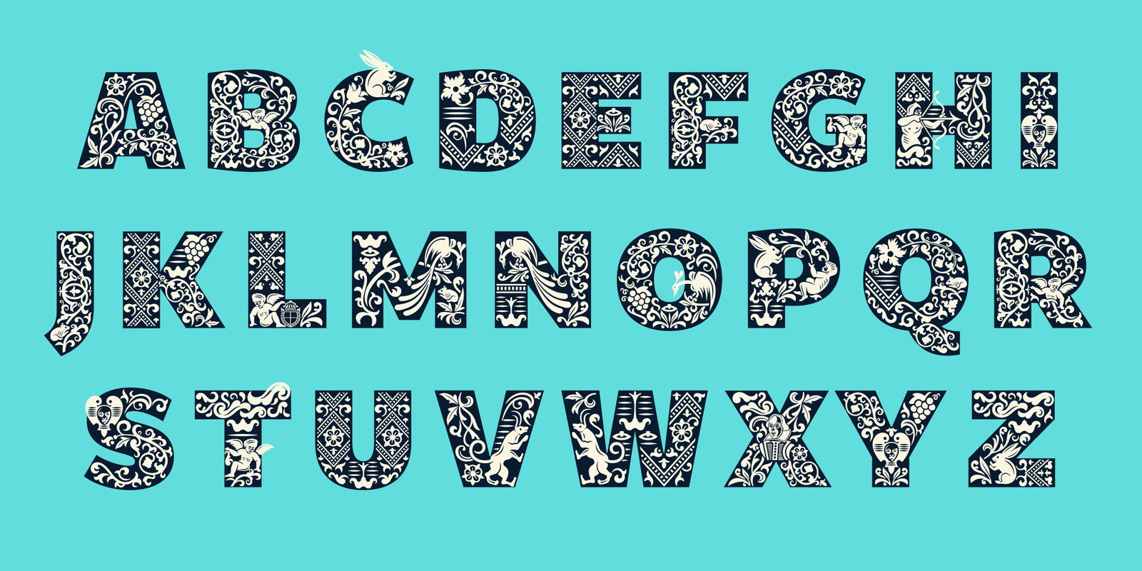
bana-io 5 hours ago
Why do they make it so damn hard to download for instance?
replyyorwba 5 hours ago
It's a custom design for the Globe theater. Of course they aren't going to let you download their unique branding, that would defeat the point.
replyjszymborski 2 hours ago
Companies regularly release their custom-made branding fonts under SIL / open licenses.
replyRobotToaster 4 hours ago
If someone with a claude subscription could turn this into a font it would be great.
reply
If anyone is curious, as I was, there is some academic research on this, although not a lot. The most in-depth "palaeotypographical" analysis I have found was this [1] paper, which also seems to correct a long-standing assumption about the printing:
"Visual and historical evidence have led me to suggest that the font is the second pica roman of the Huguenot punchcutter Pierre Haultin [...] cast for Jaggard’s use probably around 1603 or 1608 by an unknown typefounder who likely inherited the matrices from Pierre’s nephew Jerome Haultin. The font was old and in poor condition when it was used to print the Folio, which supports the view that Jaggard and his pressmen did not see the Folio as an unusually important book."
[1] http://reedreibstein.com/assets/reibstein-first-folio.pdf